CultureGeek online conference. 14 – 16 June 2021
Alex, our UK representative, recently attended the CultureGeek online conference. His report highlights one interesting session which discussed the redesign of the collections website of London’s Victoria & Albert Museum (V&A).
This session was ably led by Jack Craig, Digital Design Lead and Sitara Emily Shah, Digital Production Designer. They discussed how they designed and built a new online collection website called “Explore the Collections” which they billed as the biggest product launch in the museums’ entire digital history.
The V&A currently holds more than 1.2 million objects in its collections. Back in 2009, when it first made its collections available online, objects were on a separate website called “Search the Collections” which they regarded was “pretty ground-breaking at the time.” However, information was solely derived from curator-inputted CMS data whereas the V&A holds lots more information about these objects from various other systems. As a result, collections information had therefore become siloed. Now technology and the way people search for data has moved on. So for first time they have brought together all online editorial content with all of their collections data.
How they delivered and what they prioritised for their users had to pivot, as opposed to pivoting and changing the website completely, and they took a user-centred approach to this process. Although furlough and lockdown severely impaired how they tested and evaluated the site, they used analytics to see how visitors were using the existing site. Workshops and interviews were held at the museum and they also surveyed online users and employed a user research agency. They found that the existing site was good for someone looking for something specific but that now some users wanted to use the site for personal inspiration, as well as seeing relationships between objects. So they came up with the concept of four different search modes: Understand, Explore, Develop and Research. Users can switch between these modes, unlike the 2019 site which very much focussed on research mode.
In 2020 during the first lockdown due to the COVID pandemic there was a 37% decrease in sessions on the website overall but a 24% increase in sessions on editorial and blog content, plus a similar 23% increase on collections online. There was a visible shift in how people were using website and their vision was to reach a wider range of people. The alpha version was released internally in November 2020. From this they gained valuable feedback from colleagues. In February 2021 came the public beta release. They looked at four different modes and who they were building this for. Keyword and filtering by facets featured in the internal alpha release and this met the needs of users in Research mode. But they wanted to go further than that. Users in Understand mode (becoming aware of the collections and museum) typically browse with view to visiting. So that mode wasn’t a priority for the February launch. Core functionality therefore became focussed on Explore and Develop modes.
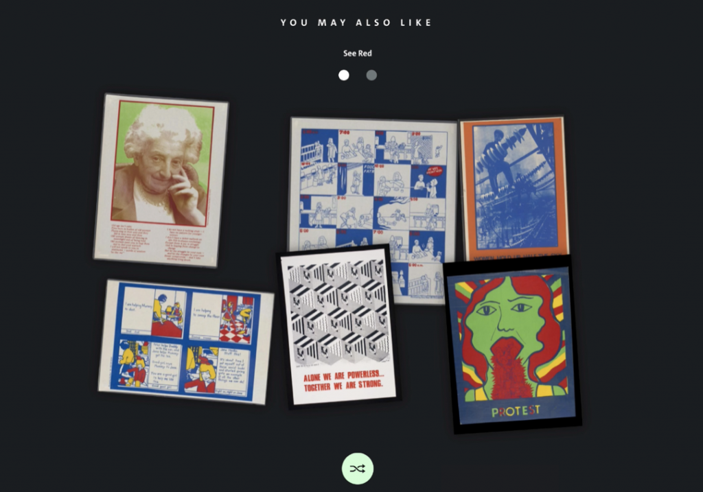
As part of the philosophy of connecting stories, the developers made connections between backend systems using shared controlled vocabularies so that end users could find what they needed in the places they expected to find them, as well as deliberately “getting lost down rabbit holes of lovely connected content.” When viewing objects in Explore mode they also showcased related objects by introducing a new feature called “You may also like” at the bottom of the object page.

As they freely admitted, this idea was borrowed from e-commerce sites which show you other items you could be interested in. They reworked this idea and gave it, as they put it, “a bit of sparkle”, creating a new visual experience. To quote them, “it’s all about encouraging unexpected, serendipitous encounters of objects” – a “kind of smorgasbord of linked objects.” The idea was to cut through the collections to show you other possibly relevant objects. They achieved this by using specific facets from the V&A’s Collections Management System. The process was technically challenging and went through a number of iterations but proved crucial in supporting discovery and providing pathways from one object to the next.
Finally, they discussed what didn’t make the cut. The pre-existing collections landing page was deprioritised. So apart from a number of web accessibility improvements the only major addition was the introduction of the simple search interface. This provides a scope search of objects to serve users who want to search. But they believe that a simple search interface is not always the best way in to the collection for many users, specifically for those in Understand and Explore modes. As the existing landing page already provided pathways to editorial content and with 70% of user journeys in the collections starting from an object page, they placed their focus on improvements to aid discovery from the object pages themselves. That being said, Discover mode improvements from the landing page are in the pipeline.