 The Museums and the Web conference is one of the best conferences for finding out the current state of play for technology within the GLAM sector. Featuring speakers from around the world, the conference goes far beyond the ‘web’ in its title, covering everything from design methodologies to virtual reality. This year’s conference was in downtown Los Angeles.
The Program
This was a milestone; the 20th North American Museums and the Web conference. It was a timely reminder that we’re still trying to solve a lot of the same problems we were working on in 1997. How do we share stories in our online projects? What experiences are we trying to provide the visitor through the use of technology? How do we remain relevant in a changing digital landscape?.
The conference excels at providing access to the research that goes into the papers. Check out the program for MW2016 which includes online papers for all of the longer sessions. The conference also has a lively #mwxx backchannel engaging with the presentations and sharing useful links.
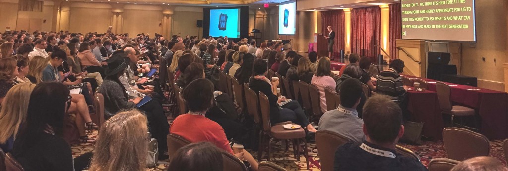
MW2016 opening session with a record number of 800 attendees
Themes
Privacy
It’s possible to gather an ever increasing array of information about our audience. Cory Doctorow’s opening plenary raised serious questions about what data is being gathered and the potential risks of data being leaked and misused. Are you open about the data you gather about visitors? Can visitors opt out of these processes? How can we make systems where users can access all the data their devices capture? What are the implications of manufacturers building devices that gather data for additional profit or surveillance beyond their key purpose? Increasingly the data we generate is the product even when we pay for a service or device.
The recording of Cory Doctorow’s plenary is well worth watching.
Data Visualisation
As data volumes grow we’re looking for new ways to see the forest AND the trees. Free tools like Watson Analytics can help guide your questions about the data and present the findings in clearer formats. Code libraries like D3 allow developers to build interactive sites to explore complex data.
Designing and prototyping
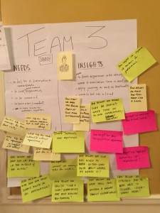
Lengthy design and development phases can be a costly way to learn that an idea isn’t going to work or has been implemented poorly. Agile development and design sprints have evolved to improve the design and build process, getting design feedback as early as possible. Product or process design is steered through continual feedback keeping teams focused on what works and on what is achievable within short time periods.
Dana Mitroff Silvers and Ahree Lee ran an excellent workshop on design sprints. In a mini version we started with some initial interviews and investigation on what it’s like to be a visitor to Los Angeles. We came up with some ideas for improving the visitor’s experience, developed some testable solutions, and built a initial prototype. The final stage, which we didn’t have time for, would be to test the prototype with real users.
Google Ventures have published their battle-tested agile process. The Design Sprint site documents how to run a five day design, prototype and test process.
Onboarding
Onboarding is the process where a person learns about an organisation’s culture and the tools in place there. This can be applied to processes our museum visitors learn when using our services. Clear and efficient onboarding can help someone new to a service get the most out of the service with the least investment in time. Many presentations during the conference touched on how each organisation explained a process to visitors. The Cooper Hewitt staff have particularly invested in administrative interfaces for staff including streamlining setting up the Pen for each new user. The interactive Pen lets visitors collect and save a record of objects that interest them during a visit and its essential for visitors to understand the use of Pen when they arrive.
Virtual Reality
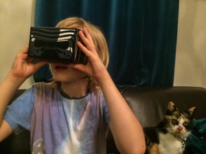 A host of new devices have emerged for immersive multimedia experiences. Oculus Rift headsets and Google Cardboard are both gaining in popularity. However, it sometimes feels like we’ve taken 40 years to develop something only a small step forward from the View-Master (and View-Master’s next model, Viewer DLX, uses the Google Cardboard platform).
I have a Google Cardboard set at home and the technology is getting better. A bigger challenge now is building up a library of genuinely interesting content so that the it doesn’t feel like a one day gimmick. Google Cardboard’s app comes with some virtual reality scenes and 3D views of real locations. Viewing the Space Shuttle up close is simple and effective. A ‘street view’ based exploration of Venice is more clunky – it’s far too slow to move through the streets. Any museum considering the use of virtual reality should look at a selection of examples to get a sense of what works (and what doesn’t).
Los Angeles adventures
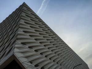
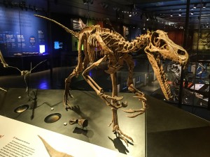
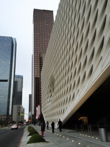
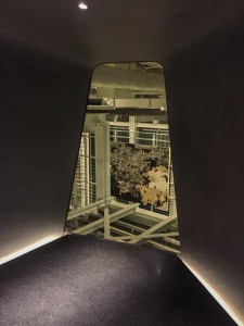
The Museums and the Web organisers did a great job selecting the papers and setting up tours and evening events to complement the conference. This included an evening visit to LA’s newest large scale art gallery, The Broad, and an evening to roam around amazing displays at the Natural History Museum of LA. I loved The Broad’s portholes for viewing the storage areas.
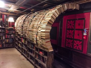
The Last Bookstore and Grand Central Market were also only a few blocks from the conference hotel. I feel like I know downtown LA a little better and I’m already looking forward to the next year’s Museums and the Web conference in Cleveland.
